Whenever a pedestrian strolls past your premises, you possess barely a split second to arrest their wandering gaze. The choice to pause, step inside, or continue onwards happens virtually instantaneously, well ahead of anyone actively absorbing your written messaging. Within this narrow window, visual tracking research offers genuine clarity. Gaze monitoring supplies an empirical framework for commercial display fabrication, ensuring that every design choice is backed by measurable human behaviour.
Understanding how prospective buyers visually map an interior or storefront enables the creation of displays that command notice promptly, read smoothly, and remain anchored in memory. In this guide, we investigate how visual tracking research pinpoints the exact elements passers-by inspect first, and how fine-tuning small design variables can dramatically elevate the performance of your brand graphics.
Applying gaze-monitoring metrics is actively redefining contemporary directional and promotional design, fostering more dependable and intuitive orientation schemes through steady testing and evidence-based layout choices.
Introduction to Visual Tracking Technology
Gaze recording tools have reshaped the manner in which commercial operations plan exterior branding and shopfront circulation. By tracking precise ocular pathways, this equipment permits retailers and creators to see the exact points where customer focus lingers when traversing a room or strolling past a fascia. Observational trials deliver concrete understanding into which structural components achieve the highest pull, separating genuine functional impact from mere decorative assumptions. Backed by measurable metrics, creators can resolve overlooked blind spots, bolster overall graphic clarity, and plot interior journeys that organically draw visitors towards primary items and counters. Consequently, gaze assessment has turned into an invaluable discipline for any venture striving to refine visitor journeys and achieve superior commercial outcomes through considered craft.

How Gaze Monitoring Operates
Optical tracking relies on calibrated sensor arrays and specialised processing tools to document precisely how an individual’s pupils travel across displays, architectural elements, or sales floors. By evaluating these recorded visual pathways, businesses obtain clear evidence regarding what commands genuine fascination and what fails to register. Detailed field trials reveal which proportions pull the eye most effectively and pinpoint which retail elevations shoppers notice consistently. These evaluation methods function seamlessly across real-world architecture and virtual simulations, highlighting how visitors interact with information systems and negotiate spatial hurdles. By building on these concrete observations, business proprietors can position their branding in prime focus areas and produce settings that are both visually captivating and straightforward to navigate.
Why Visual Assessment Matters for Commercial Spaces
Gaze research documents organic optical patterns: the initial landing target, dwell duration, and the particular physical cues that repeatedly summon focus. These visual routines follow remarkably uniform rules. In overstimulated settings like bustling town centres, retail parks, or corporate entryways, the human nervous system filters out excessive stimuli to prevent sensory fatigue. Your display must bypass this automatic mental barrier.
Whenever aesthetic choices stem from genuine gaze metrics rather than speculative taste, commercial managers can commission new installations with absolute certainty.
The primary benefit of optical measurement lies in discovering what commands notice quickest. The real answers frequently confound conventional wisdom. A modest adjustment in tonal distinction, dimensional projection, or wall elevation can elevate visibility significantly, occasionally by half again or higher in controlled tests.
For trading ventures, this translates into sharp brand legibility, commanding introductory views, and increased client footfall. Continual evaluation guarantees that physical updates yield tangible enhancements in patron interest.
Where Visitors Actually Look When Walking Past
Gaze metrics outline several uniform optical traits among pedestrians. These findings were gathered through controlled trials incorporating diverse respondent groups, remaining consistent across various age brackets, backgrounds, and regional locations.
1. Focus Gravitates Towards Pronounced Tonal Contrast First
Our perceptual wiring is inherently tuned to register strong value differences. This explains why stark light against dark backgrounds or deep lettering over pale foundations catches attention without delay.
In physical branding, this dictates straightforward guidelines:
Eye monitoring produces heat maps illustrating initial ocular fixation, giving creators a direct visual representation of which sign elements pull the strongest focus.
This principle explains why bold dimensional lettering and high-contrast signage perform with such immediate clarity. Assessing customer gaze records allows you to refine your visual assets for maximum real-world engagement.
- Pronounced tonal contrast is deciphered ahead of everything else
- Subdued, low-contrast combinations are frequently bypassed altogether
- Non-reflective matt surfaces cut unwanted glare and preserve legibility under harsh downlights
- Subtle backlighting commands the gaze reliably across daytime settings
2. Sightlines Rest at Direct Eye Level Rather Than Roof Ridges
Observational trials verify that ordinary pedestrian sightlines sit between 1.4 metres and 1.8 metres from floor level while walking. Architectural features positioned noticeably higher or lower receive considerably less spontaneous focus, especially while people are travelling at pace.
This spatial reality explains several common design outcomes:
Empirical visual analysis confirms a fundamental truth: the simplest message to digest is whatever sits directly where human eyes organically rest.
- Pavement-mounted displays like portable A-boards yield immediate roadside pickup
- Glazing vinyls and entry graphics set at median height attract far higher engagement
- Fascia lettering mounted excessively high up building elevations frequently underdelivers
3. Optical Shift and Dimensional Shadow Summon Immediate Focus
Even minimal visual variations, such as wandering ambient shadows or gentle illumination, register instantly. Human optical survival instincts remain tuned to detect changes across physical fields.
Because of this instinct, displays incorporating distinct physical traits command superior interest:
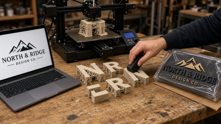
A completely flat 2D graphic simply cannot match these physical characteristics. Our fully 3D printed business logos benefit immensely here, capturing ambient daylight and cast shadows that shift across the day, generating subtle textural contrast that the human eye instinctively follows.
Frame-by-frame analysis of ocular motion highlights how physical variation commands attention. Transport authorities testing station advertisements have shown through gaze monitoring how dynamic dimensional components outshine flat billboards, validating how empirical testing refines commercial display strategy across crowded public concourses.
- Shifting highlights across silk-sheen filaments
- Gentle peripheral wall illumination from rear stand-offs
- Tactile, crisp perimeter edges casting real shadows
- Physical projection that steps forward from the mounting plane
4. Gaze Direction Begins on the Left
In cultures that read text from left to right, visual monitoring demonstrates conclusively that attention starts towards the left border of any focal field. This tendency dictates layout balance far more profoundly than standard graphic conventions suggest.
This reading instinct yields specific structural requirements:
A deliberate realignment of your primary shapes can substantially increase instant brand recognition, helping you resolve legibility hurdles before fabricating permanent assets.
- Your primary trading name or key message should align towards the left flank
- Logomarks or emblem icons placed on the left side achieve immediate identification
- Lengthy central text strings prove considerably harder to interpret while in motion
5. Human Perception Favours Recognisable Emblems and Profiles
Our cognitive architecture prioritises iconic outlines, human representations, and clean geometry. Because of this natural tendency:
Commercial displays incorporating unmistakable geometric outlines or distinct graphic emblems routinely outperform cluttered, word-heavy panels during optical monitoring tests.
Designing around these hardwired cognitive priorities produces significantly more functional branding installations.
- Stylised visual marks are registered far faster than written sentences
- Curved and circular forms are recognised effortlessly over extended viewing distances
- Brand icons with uncluttered silhouettes imprint deeper inside visual memory
Core Principles for High-Performing Signage Design
Applying visual tracking discoveries allows makers to refine branding layouts with genuine precision, reinforcing visitor guidance throughout physical spaces.
Synthesising the observational data outlined above yields several definitive visual tenets.
1. Prioritise Simplicity to Aid Cognitive Processing
Convoluted designs impede message intake and hinder mental retention. Streamlined compositions mirror how human vision naturally categorises scenes, letting observers interpret and recall core details effortlessly. Uncluttered arrangements highlighting one or two crucial points consistently outperform crowded layouts.
2. Maximum Contrast Guarantees Readability
If you apply only one finding from perceptual tracking trials, let it be this principle. Absent adequate tonal distinction between letterforms and background surfaces, your message will remain functionally invisible to casual passers-by.
3. True Depth Multiplies Visual Attraction
Raised lettering, tactile facings, and dimensional components catch real ambient light and throw natural shadows. While traditional commercial workshops often rely on gloss acrylic or fabricated metal sheets, KianoStyle achieves authentic depth by 3D printing solid PLA or PETG elements in our North Somerset workshop. These multi-part layered builds deliver organic edge contrast that flat print never replicates.
4. Strategic Elevation Decides Everything
An impeccably styled graphic affixed at an improper height, tucked beneath deep overhangs, or lost amidst visual noise will fail to engage audiences regardless of aesthetic quality.
5. Illumination Transforms Baseline Impact
Thoughtful lighting dramatically enhances pickup even across daylight hours, taking full advantage of human sensitivity to radiant balance. Mounting an opaque 3D printed logo on raised stand-offs over an internal LED tray casts an atmospheric halo against the wall, boosting contrast without creating blinding glare.
Evaluating Common Display Formats in Visual Testing
Optical research demonstrates that specific construction methods vary dramatically in their capacity to arrest passing foot traffic.
Here is how standard signage formats perform under controlled examination:
Pavement Boards and Pedestrian Displays
These units secure the highest marks for immediate pickup simply because they sit dead centre within natural walking gaze angles. A well-sited pavement display, such as our weather-resistant 3D printed PETG A-board featuring colour-inlaid panels, directs foot traffic effortlessly towards store entrances.
Three-Dimensional Wall Logos
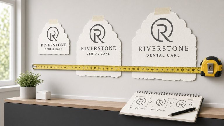
These options rank exceptionally high in retention metrics because true structural projection forms tangible shadows and crisp perimeter definition. Our 20mm, 40mm, and deep 55mm honeycomb PLA logo signs provide that precise physical presence, presenting solid filament colour all the way through.
Fascia Tray Systems
Commercial trays achieve high visibility due to substantial structural projection and clean geometric borders. While the broader sign industry constructs these from folded aluminium or sheet metal, our workshop crafts distinct 3D printed plaque alternatives, incorporating raised multi-colour logo components layered over solid printed backings.
Natural and Textured Plaques
Displays incorporating organic textures achieve remarkable emotional connection; gaze trials reveal people spend longer admiring tactile warmth. While traditional shops often use UV-printed timber boards, we produce rich alternatives 3D printed in wood-fill PLA containing genuine timber fibres, finished with raised or recessed lettering.
Flat Plaques and Lettering
While the commercial sign industry frequently utilizes laser-cut flat acrylic panels, glossy perspex, or printed vinyl stickers, these formats can suffer from harsh glare or flat lifelessness. KianoStyle offers flat alternatives including our 2mm ultra-thin 3D printed wall decals and 5mm flat letterforms printed in satin silk or matt PLA. These provide crisp contrast without artificial gloss or reflective washout.
Interpreting Visual Metrics for Commercial Layouts
After capturing ocular movement across physical settings, the subsequent task involves evaluating recorded visual pathways to establish behavioural patterns. By studying how pedestrians inspect varied signage layouts and floor plans, business owners can pinpoint which displays trigger immediate engagement and which corners suffer from visitor neglect. Scrutinising heat maps and gaze trajectories allows fabricators to highlight prominent components and realign surrounding elements for balanced visual weight. This empirical method lets enterprises evaluate practical questions, like whether a bolder typeface outperforms an older monogram, and validate design updates through concrete physical evidence. Interpreting these patterns empowers proprietors to select optimal mounting heights, refine graphic styling, and establish intuitive spatial flow, ensuring every branded touchpoint works cohesively to steer patrons through the building.
Crafting Intuitive Commercial Environments
Planning an effective physical layout extends beyond superficial interior decorating; it requires understanding customer movement, noting where attention settles, and making orientation straightforward. By studying visual tracking observations, commercial teams can devise store layouts that balance aesthetic elegance with natural guidance. Specifically, gaze trials demonstrate which sectors of a floorplan capture attention effortlessly and which sign styles effectively direct foot traffic toward core merchandise or reception desks. Armed with these discoveries, designers can place wayfinding aids purposefully, open unobstructed walkways, and leverage dimensional elements to accent focal zones. The resulting environment presents a cohesive, professional image while simplifying visitor navigation and elevating commercial conversion by helping guests find their destination without friction.
Why Empirical Design Matters for Your Brand
The deeper your insight into how prospective clients visually survey your fascia or corporate reception, the easier it becomes to commission displays that perform reliably in everyday conditions. Optical data pinpoints distracting visual clutter that diverts attention away from your branding, allowing our studio to refine layout geometry so core information is never missed.
Applying gaze-tracking lessons enables you to:
Field testing also measures the real duration of customer curiosity around your reception signage and confirms the presence of an unmistakable focal point across your premises.
Ultimately, your company branding evolves from merely pleasant decor into an installation engineered around proven perceptual science.
- Mount signs within genuine visual paths where eyes naturally settle
- Select filament textures and finishes that catch daylight without blinding reflection
- Choose complementary tonal palettes that maximise instant readability
- Streamline lettering layouts for swift recognition on the move
- Strengthen long-term brand recall through pronounced three-dimensional contrast
Engaging Audiences Through Visual Narrative
Functional signage grabs notice rapidly, but memorable branding holds that attention long enough to spark genuine emotional rapport, interest, or brand recognition.
Visual research confirms that:
Blending hard optical principles with tangible craftsmanship produces commercial branding that leaves a lasting mark. Real-world retail and hospitality spaces consistently demonstrate how bespoke dimensional pieces generate memorable customer journeys that flat wall prints cannot match.
- Tactile materials, like our wood-fill PLA, encourage longer dwell periods
- Balanced halo illumination evokes a warm, premium emotional response
- True physical depth conveys quality, durability, and commercial permanence
- Clean geometric marks ensure faster cognitive recall long after departure
Conclusion
Empirical eye-tracking investigations prove conclusively that patrons do not inspect signage through the idealized steps many designers assume. People scan at speed, latch onto distinct contrast, filter out surrounding clutter, and register depth, shadow, and warm glow by pure instinct.
Conventional flat printed boards in high-traffic hubs face genuine drawbacks, as static footfall tallies provide no guarantee that pedestrians actually notice flat paper displays. Gaze tracking exposes these limitations, offering precise insight into what individuals genuinely see and engage with in busy commercial environments. Across transport hubs, digital and high-impact dimensional signage increasingly replaces flat boards because dynamic, tactile structures capture natural ocular movement far more successfully than two-dimensional printed media.
By weaving gaze-tracking lessons into your business branding, you can design features that harmonise with natural human sightlines rather than fighting against them. This approach yields immediate visibility, a professional introductory impression, and increased customer footfall through your doors.
Whether you choose our 20mm, 40mm, or ultra-deep 55mm 3D printed business logo wall signs, an eye-level pavement A-board, or a textured wood-fill reception plaque, grounding your specifications in ocular science ensures every display delivers maximum commercial return.
Bring Scientific Impact to Your Wall Signage
Ready to transform your business branding into an eye-catching focal point? Explore our shop for bespoke 3D printed wall signs, request a free quote, or upload your artwork today for a complimentary digital proof and expert design feedback from KianoStyle.