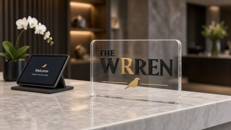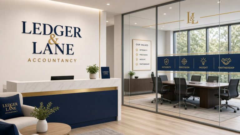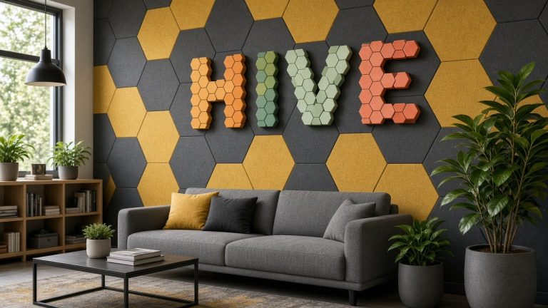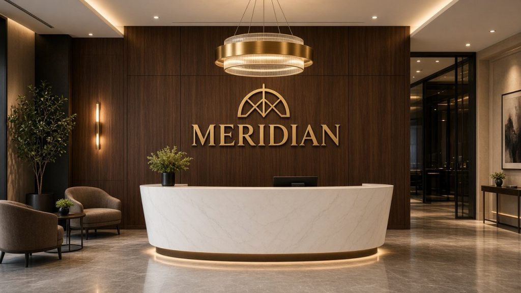
Your front entrance frequently provides clients and candidates with their very first tangible touchpoint with your organisation. Long before stepping into a boardroom, greeting your front-of-house team, or reviewing your proposals, guests unconsciously evaluate your professionalism based on the immediate interior environment.
Carefully planned entrance branding ensures this initial encounter feels organised, credible, and seamlessly aligned with your corporate identity. Beyond confirming immediate arrival, thoughtful wall displays anchor the room and tie your architectural finishes together. Striking commercial signage does not require excessive scale or overwhelming complexity; outstanding results stem from selecting the ideal placement, proportions, tactile finishes, and complementary illumination for your interior.
Why Does Reception Signage Matter?
A workplace foyer must balance several duties simultaneously.
It has to greet incoming guests warmly, project company standards, and orchestrate an orderly passage between the exterior threshold and core working zones.
Intentional signage directly facilitates all three functions.
A dimensional emblem positioned prominently over the front counter reassures arrivals instantly that they have reached the intended premises. Meanwhile, clear navigational plaques route foot traffic toward meeting suites, passenger lifts, or facilities. Clear informational displays handle common practical queries, preventing reception staff from answering repetitive administrative questions.
Furthermore, entrance branding dramatically shapes the visual ambience of the entire floor plan.
Within contemporary commercial workspaces, graphic branding is woven directly into interior architecture rather than treated as a decorative afterthought. Coordinated wall treatments, furniture, lighting palettes, and physical emblems collaborate to establish a unified corporate interior.
Reception Signage Ideas for Different Office Styles
No single signage concept suits every corporate reception.
The most effective solution depends entirely on your sector, the dimensions of your greeting area, and the specific atmosphere your company wishes to cultivate.
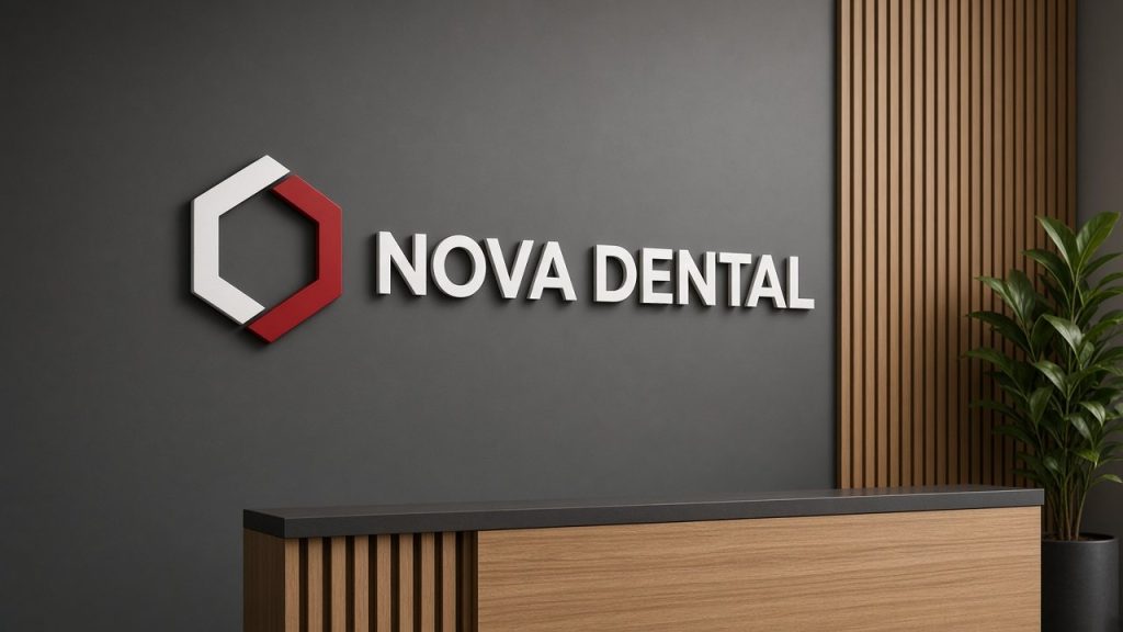
Raised Company Logo Behind the Reception Desk
Among the most timeless front-of-house concepts is mounting an elevated emblem directly onto the wall expanse commanding the central desk.
This configuration establishes an unambiguous focal point, making your identity visible the moment visitors step across the threshold.
Individual three-dimensional letters or distinct graphic icons grant tangible substance without dominating the architectural scheme. While the broader sign industry frequently relies on fabricated sheet acrylic or cut aluminium, bespoke additive manufacturing achieves comparable presence using lightweight FDM printing in solid-colour PLA filaments. Each component has pigment infused throughout rather than surface-coated, offering a clean, contemporary relief.
This arrangement proves exceptionally successful whenever the main greeting station sits directly in line with exterior access doors.
Logo on a Backing Panel
Mounting your emblem across a dedicated structural backboard provides an ideal solution when dealing with heavily textured surfaces, exposed brickwork, or walls unsuited to mounting dozens of individual loose characters.
A supporting substrate introduces a crisp visual boundary that can either subtly complement the room’s woodwork or provide decisive contrast against wallpaper.
Commercial fabricators often specify heavy cast perspex panels, yet a fully 3D printed backing plaque created in matt or satin filament provides an equally refined, lightweight alternative. For instance, pairing deep charcoal dimensional lettering against an off-white printed backboard yields crisp visual clarity, whereas warm wood-fill PLA backplates paired with silk metallic lettering generate an inviting, executive aesthetic.
Feature-Wall Signage
Certain workplace layouts function far better when the primary branding sits away from the main counter.
A generous decorative feature wall frequently presents a superior canvas, particularly when arrival corridors direct foot traffic past the greeting desk at an acute angle.
Positioning your emblem across an open flanking wall balances broader spatial proportions and maintains visual prominence across several sightlines.
Signage on Glass Partitions
Full-height structural glazing remains a standard feature in modern office partitions, yet transparent surfaces present unique mounting considerations.
While standard sign shops typically apply adhesive vinyl decals, you can also mount lightweight, ultra-thin 3D printed graphics directly onto glass partitions using neat, pre-applied bonding adhesives.
Tonal distinction is vital in glazed settings. A colour scheme that appears striking against solid plasterboard can become completely illegible when viewed against translucent glass, shifting daylight, and dynamic background activity.
Minimalist Reception Signage
Certain minimalist interiors require a restrained, subtle touch.
Compact dimensional letterforms, understated monochrome emblems, or satin metallic finishes in silk silver PLA integrate smoothly into disciplined architectural spaces where understated materials already dominate.
Simplicity never implies a lack of impact. Exacting kerning, balanced proportions, and careful fabrication standards ensure an understated sign still commands immediate respect.
Choosing the Right Materials
Material choices govern considerably more than simple visual appeal.
They determine overall weight, depth, installation requirements, long-term indoor durability, and how harmoniously the piece integrates with surrounding furnishings.
Acrylic
Cast acrylic sheet is a traditional staple across commercial sign-making, celebrated for extensive sheet colours and sharp laser-cut edges.
It commonly forms flat cut letters, thick layered emblems, or transparent background backboards.
High-gloss acrylic yields a glassy, reflective surface, whereas matt perspex softens reflected glare. At KianoStyle, we do not fabricate with acrylic sheeting; instead, we engineer equivalent dimensional depth through precision FDM 3D printing using specialised silk PLA filaments. These deliver a lustrous satin sheen without mirror reflections, displaying a subtle micro-layer texture on close inspection that reflects artisanal digital craft.
Metal and Metallic Finishes
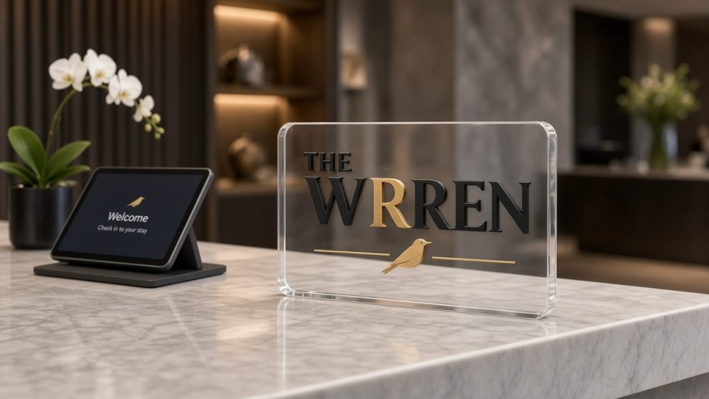
Genuine metallic signs in machined brass, brushed bronze, or folded aluminium are widely specified across corporate headquarters, legal practices, and luxury hotel foyers.
Fabricated sheet metals provide a solid, industrial, or architectural presence.
However, metallic treatments must genuinely complement brand positioning rather than merely acting as an expensive visual trope. Mirror-polished stainless steel often appears jarring in an informal tech workspace, whereas silk or matt metallic filaments offer a restrained, architectural lustre without excessive weight or industrial fixing demands.
Wood
Natural timber elements imbue public areas with warmth, texture, and organic character.
Timber works brilliantly for design agencies, sustainability consultants, and organisations wishing to appear approachable rather than starkly institutional.
Soft grain tones harmonise effortlessly with biophilic interior plants, natural woven fabrics, and warm neutral paint tones. Alongside real laser-engraved birch plywood, we produce bespoke panels using genuine wood-fill PLA, which blends authentic recycled wood fibres into the filament for a tactile, matte timber appearance.
Layered Materials
Combining complementary substrate finishes builds captivating visual depth and tactical contrast.
In conventional fabrication, glossy acrylic faces are bonded to composite foam backings, but multi-part additive manufacturing achieves identical structural interest by assembling distinct filament components. A silk copper logo mounted onto a dark, matt-printed base creates clean separation while maintaining structural integrity.
Every composite layout must remain faithful to brand guidelines rather than incorporating superfluous layers that distract from clarity.
Flat or Dimensional Reception Signs?
Both planar graphics and raised letterforms hold valid roles in corporate design schemes.
Two-dimensional graphics suit budgets requiring rapid installation, minimal wall loading, or temporary directional information that changes periodically.
Conversely, three-dimensional signage delivers unmistakable architectural substance.
Physical relief creates shifting shadows and natural highlights throughout the day as indoor light transitions, giving the display commanding presence across open floors.
Dimensional branding is particularly recommended when your corporate crest serves as a durable, long-term focal element within your principal reception lounge.
Organisations looking to refresh their corporate premises can explore our custom office logo signs.
How Large Should Reception Signage Be?
Dimensional calculations must evaluate the complete wall canvas rather than viewing artwork files in isolation.
A vector design that appears commanding across a desktop monitor can appear surprisingly modest when installed onto a four-metre plasterboard wall.
Conversely, an excessively massive display risks overpowering an intimate greeting foyer.
Carefully assess the following spatial metrics:
- the total horizontal width and vertical clearance of the target wall
- the typical distances from which entering visitors will view the display
- the physical scale and visual mass of your greeting desk
- adjoining door frames, acoustic wall panels, and digital display monitors
- the overall floor-to-ceiling elevation
- whether the display needs to maintain legibility from oblique walking angles
A dependable installation trick involves outlining the planned dimensions onto the plasterboard using low-tack masking tape or drafting paper before ordering.
Testing physical boundaries on site imparts an accurate understanding of room proportions that digital proofs cannot fully replicate.
To explore in-depth dimensional calculations and layout recommendations, review our dedicated guide to choosing the right logo sign size.
Where Should a Reception Sign Be Positioned?
Accurate horizontal and vertical positioning proves just as vital as proportional scaling.
Behind the Reception Desk
This spot represents the most intuitive positioning since visitors naturally guide their attention toward the staff member waiting to welcome them.
The artwork should be centred comfortably above head height so computer monitors, decorative counter lamps, or standing personnel never obstruct the lettering.
On the Main Feature Wall
If your counter sits offset to one side or hidden behind a partition upon entry, an adjacent structural wall often supplies a far more commanding canvas.
Selecting an open accent wall also accommodates broader sign dimensions without competing with counter equipment.
Near the Entrance
Positioning branding adjacent to access doors helps clarify navigation within multi-tenanted business centres or shared corporate hubs.
Immediate threshold displays remove ambiguity, confirming guests have stepped into the correct suite before they even approach the desk.
Within the Waiting Area
Introducing a refined secondary logo mark or branded message within seating lounges can subtly reinforce corporate values while guests wait for appointments.
Nevertheless, repeating your primary badge indiscriminately across every surface undermines visual sophistication.
A single, confident focal installation almost always achieves superior prestige over scattered, competing logos.
Using Lighting With Reception Signage
Careful illumination makes an extraordinary difference to how dimensional letters present in physical space.
Even masterfully crafted letterforms can look lacklustre if left stranded in an unlit alcove or washed out under cold, unshielded fluorescent tubes.
Existing Room Lighting
Prior to commissioning dedicated electrical displays, audit the existing ambient illumination.
Recessed ceiling downlights, directional spotlights, and natural exterior light often cast captivating natural shadows beneath 20mm to 55mm deep dimensional lettering without requiring extra cabling.
Panel Halo Lighting
While conventional sign makers fabricate complex folded metal letterforms packed with internal modules, subtle illumination can be achieved with our 3D printed backlit sign. This approach mounts an opaque PLA logo on concealed stand-offs over a custom printed tray housing an integrated LED strip, washing a delicate halo glow across the rear wall without revealing raw wiring.
This arrangement delivers an atmospheric silhouette around the logo perimeter while retaining a neat, plug-in design.
When backlighting works best
Edge glow and halo lighting perform exceptionally well across dimly lit reception lounges, windowless basement foyers, or suites requiring strong evening visibility. Opting for clean warm white, crisp neutral daylight, or variable RGB strips allows the illumination to mirror interior colour palettes and brand styling.
Lighting must always flatter the three-dimensional shapes rather than overwhelming the room with harsh glare.
Colour and Brand Consistency
A corporate wall display does not necessarily need to replicate every complex gradient or micro-tone found within digital brand guidelines.
In many executive settings, distilling a complex colour scheme into a refined single-tone finish or high-contrast monochromatic layout yields a significantly more polished finish.
The fundamental objective is ensuring your dimensional emblem remains instantly recognisable while honouring the architectural setting.
Consider how the following factors interact:
- registered brand pantones
- underlying wall paint and sheen level
- hardwood, tile, or carpeted flooring textures
- counter finishes and soft furnishing fabrics
- colour temperature of ceiling lamps (warm versus cool Kelvins)
- accompanying digital screens and glass manifestations
- existing hardware finishes throughout the interior
Vibrant brand colours stand out wonderfully across neutral backdrops, whereas restrained metallic filaments like silk gold or matt silver sit comfortably against richly saturated feature walls.
Tonal contrast remains non-negotiable.
Mounting navy blue lettering against a slate grey backdrop neutralises impact, even if both shades technically mirror your official corporate brand book.
Reception Signage for Small Spaces
A compact reception vestibule does not relegate you to an uninspired, flat graphic sticker.
The key priority is simply avoiding physical clutter that overwhelms tighter square footage.
Individual 3D letters with a moderate 20mm profile provide crisp architectural shadow lines without demanding a heavy surrounding backplate.
Securing individual lettering flush to the wall maintains visual breathing room around modest counters.
Within compact lobbies, balanced typography and honest material finishes routinely outperform heavy, ornate multi-layered fabrications.
Reception Signage for Larger Offices
Sprawling corporate lobbies present the inverse problem.
A standard office sign can quickly appear dwarfed when positioned against expansive wall spans or cavernous double-height atriums.
Spacious commercial environments often necessitate:
- substantially larger letter heights
- wider, airier kerning between distinct elements
- bold tonal contrast against surrounding surfaces
- deeper dimensional profiles, such as 40mm or 55mm letter depths
- integrated halo illumination to boost visual punch
- complementary directional plaques to manage visitor flow
Viewing distance becomes the governing design parameter in expansive spaces.
Guests stepping into a large reception atrium will observe your branding from dozens of metres away; fine details and delicate sub-text that look legible on a desk proof will simply vanish across wide viewing distances.
Directional and Informational Signs
Not every wall fixture within your reception needs to focus exclusively on primary brand identity.
Coordinated directional signs direct visitors smoothly toward executive boardrooms, passenger lifts, restrooms, or breakout zones.
Equally, clear informational signage can discreetly communicate digital check-in steps, opening hours, or guest Wi-Fi details.
These auxiliary functional plaques should harmonise with your central feature sign rather than clash with it.
Specifying matching filament tones, cohesive typefaces, and uniform fabrication depths ties the entire interior together into a polished corporate space.
Common Reception Signage Mistakes
A successful front-of-house sign is the cumulative outcome of numerous measured decisions working in harmony.
Fortunately, the most frequent design pitfalls are remarkably straightforward to sidestep.
Choosing a Sign That Is Too Small
This remains the most prevalent mistake on expansive feature walls.
Lettering may appear perfectly readable when standing directly in front of the counter, yet lose all commanding presence from the main entrance doors.
Poor Contrast
Dimensional lettering demands sharp tonal differentiation from the underlying wall finish.
Sticking rigidly to official corporate palette colours is counterproductive if the emblem disappears against an identically toned paint background.
Ignoring the Reception Desk
The physical workstation below directly shapes how the wall above is perceived.
Desktop monitors, counter plants, desk dividers, and receptionists standing to welcome guests can inadvertently obscure bottom lettering lines if height clearances are neglected.
Mounting the Sign Too High or Too Low
Correct mounting elevations depend on room scale, but the artwork must always feel naturally anchored to the reception setting rather than drifting up toward ceiling vents or dropping behind furniture.
Too Many Competing Elements
Framed certificates, digital screens, notices, and artwork can rapidly turn a reception wall into a busy visual mess.
If your central emblem is intended as the primary brand statement, grant it generous perimeter space so it can command the room effectively.
Choosing Materials Without Considering the Environment
A material finish that looks appealing on a sample board can completely clash once mounted on site.
Substrate choices must explicitly consider ambient wall texture, existing light fixtures, counter joinery, and broader workspace decor.
Creating a Strong First Impression
Entrance signage represents only one piece of a welcoming front office, but it often serves as the defining element guests remember.
Flawless outcomes arise from approaching the sign as an architectural component of the room rather than merely fastening an emblem onto bare plaster.
Always evaluate how these core spatial elements interact:
- your core emblem geometry and complexity
- the dimensions and profile of the front counter
- underlying wall paint finish and texture
- ambient downlighting and directional spotlights
- nearby waiting furniture and architectural joinery
- sightline distances from entrance doorways
- the path of natural visitor movement through the reception
When these components align seamlessly, your reception branding reinforces your company’s professional reputation effortlessly without appearing forced or overly promotional.
Final Thoughts
Exceptional reception sign design extends far beyond ordering a flat vector graphic and sticking it to an empty wall.
Careful alignment, proportional scaling, tactile filament selection, deliberate contrast, and ambient lighting all dictate how effectively your brand resonates with visitors.
Raised 3D letters inject architectural weight and cast natural shadow lines across the entrance. While traditional sign shops offer acrylic sheeting or metal fabrications, modern 3D printing provides an exacting, sustainable alternative in solid PLA finishes, rich wood-fill filaments, or lustrous silk metallics. Subtle halo illumination can transform darker reception foyers, whereas crisp, unlit dimensional lettering often provides the cleanest look across well-lit, contemporary offices.
The most compelling reception signage ideas are consistently those that integrate naturally with the room’s architecture while articulating your business identity with clarity.
If you are preparing a custom branded display for your workplace, explore our 3D printed business logo signs or contact our workshop team to review your concept.
Elevate Your Workplace Reception
Send us your vector artwork for a free digital proof and mock-up. We design, 3D print, and hand-finish bespoke dimensional logo signs right here in our North Somerset workshop.