Whenever business owners begin planning branded displays, their initial attention usually drifts towards dimensions, colour palettes, or graphic emblems. Yet typography remains the single design component that gets disregarded most frequently, despite having the largest bearing on immediate comprehension. Choosing an overly intricate or convoluted typeface instantly undermines your message. The letterforms you select determine not merely how swiftly someone deciphers your wording, but also the unconscious impression they form regarding your enterprise. Because of this, picking lettering requires evaluating both aesthetic appeal and practical performance across varied environments, from high-street fascias and pavement displays to dimensional wall lettering in a commercial lobby.
This introductory handbook provides a thorough grounding in typography fundamentals for physical branding, demonstrating why legibility matters and highlighting common formatting traps to bypass. By reviewing these core principles, you will gain the clarity needed to select lettering that communicates effortlessly and captures target footfall. Every typeface conveys an inherent personality: streamlined geometric characters signal modern efficiency, whereas fluid script lettering suggests warmth and craft. If passing trade struggles to decipher your name in a heartbeat, they will simply look away, and an unconsidered font choice risks projecting an amateurish image before a single word has been spoken.
Why Font Choice Really Matters in Signage
A prospective patron glancing towards your premises grants you merely a brief couple of seconds to convey your identity and trade. Uncomplicated, instantly legible lettering ensures that core greeting registers instantly without ambiguity. Simultaneously, the structural posture of the characters establishes your company tone, presenting the public with an accurate summary of your service standards. Crisp sans-serif letterforms tend to broadcast sharp competence, whereas softer cursive styles communicate bespoke friendliness. When typography proves excessively ornate, passers-by rarely spend precious energy attempting to unravel it, choosing instead to carry on walking. Selecting the correct typeface bridges the gap between effortless visual recognition and enduring aesthetic appeal, which is why legibility and typographical geometry must always be developed together.
Fonts Explained in Simple Terms
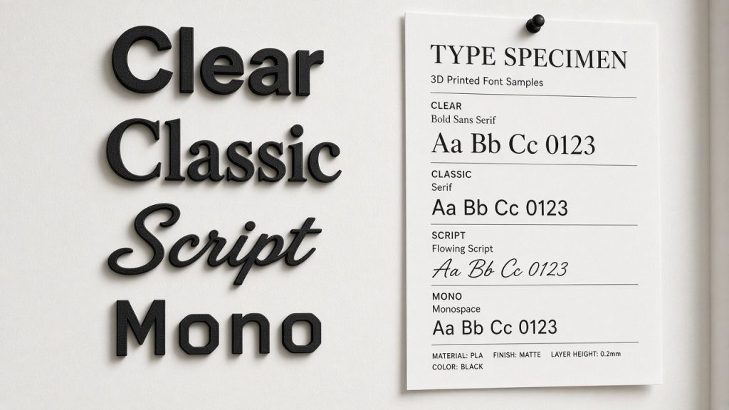
To demystify typography before committing to a physical sign, it helps to review the primary letter styles encountered across visual branding:
The true functional success of any typeface hinges upon glyph structure and internal balance. Characters with irregular baselines or uncomfortably narrow kerning quickly blur into an illegible smear, creating unnecessary barriers for everyday viewers and presenting notable obstacles for neurodivergent visitors or individuals experiencing visual processing challenges.
- Serif letterforms: These feature tiny finishing strokes or feet projecting from letter terminals. These subtle flourishes assist horizontal optical tracking across a sentence, imparting an established, trustworthy tone. Historic alphabets such as Garamond, shaped by sixteenth-century French punch-cutters, exemplify this sophisticated, traditional balance.
- Sans-serif letterforms: Defined by clean edges without decorative terminal feet, exemplified by stalwarts like Helvetica. Modern organisations favour these heavily because their uncluttered anatomy guarantees instant optical recognition across considerable distances.
- Script typefaces: Designed to evoke calligraphic pens or flowing handwriting. While visually charming on invitations, they quickly become taxing to decode across extensive text runs or at modest scales.
- Display typography: Exaggerated, high-impact designs engineered specifically to capture visual focus. While superb for punchy single-word headers, their dense styling makes them unsuitable for supporting paragraphs.
Font Categories: Sans Serif, Serif, Script Fonts
Familiarising yourself with the fundamental typography classifications makes narrowing down appropriate signage styles considerably simpler. Sans-serif families remain a staple for commercial fascias and public-facing displays because their uniform stroke widths deliver undeniable clarity from afar. Whether applied across external building signage or deployed within busy corporate foyers, these clean-edged characters project structured efficiency while remaining decipherable across wide viewing angles.
Traditional serif typefaces provide a grounded, established presence thanks to their distinct terminal footings. While historically favoured for prolonged reading across printed books and periodicals, they lend a dignified, time-honoured authority to physical plaques and corporate directory signs, making them especially suited to professional practices seeking to communicate enduring reliability.
Script classifications simulate graceful penmanship and cursive lettering, introducing artisanal charm and individual personality to brand emblems. However, they demand careful restraint; overusing ornate flourishes on signs often leads to unreadable clutter, particularly under directional daylight or from moderate viewing distances. Balancing these distinct categories correctly allows an enterprise to showcase distinct flair without compromising quick-glance communication.
Fonts and Readability in Signage
True legibility involves far more than merely selecting an attractive typographic family; several environmental and spatial criteria govern how rapidly an audience comprehends your wording at first glance:
An enduring benchmark within visual branding suggests that if an onlooker cannot comprehend your sign wording inside five seconds, the underlying typography and visual hierarchy require immediate revision.
When typography transitions into a tactile brand feature, letter structure must also translate successfully into three dimensions. At our workshop, we manufacture dimensional business displays by 3D printing individual lettering elements in solid coloured filament, where clean letter anatomy ensures crisp fabrication.
- Tonal contrast: Maintaining stark separation between letters and the backing substrate ensures individual characters pop forward. Using deliberate colour divergence significantly heightens distance recognition; deep text set against pale backdrops, or bright white lettering against dark panels, remains the most dependable approach, whereas low-contrast pairings such as soft grey on cream wash out outdoors.
- Character height: Physical scale directly determines readable distance. Lettering intended to be interpreted from across a dual carriageway or pedestrian concourse requires substantial vertical height to preserve clarity.
- Typographic spacing: Proper letter-spacing (tracking) and vertical row separation (leading) dictate visual flow. Generous breathing room between neighboring letters prevents characters merging together, avoiding both congested clumps and disjointed gaps.
- Visual restraint: Avoid overcrowding your display with competing type styles, conflicting shades, or superfluous borders, as minimalism almost always generates clearer visual communication.
Outdoor Signage Considerations
Planning external branding requires accounting for ambient distraction and fluctuating weather conditions rather than purely focusing on wording. Selecting medium-to-bold stroke weights usually proves the safest strategy for exterior signage, as thicker stems maintain character integrity against varied architectural backgrounds. Dimensions must also be calibrated against actual viewing distances, whether patrons approach on foot or pass by in road traffic.
Tonal separation between characters and mounting surfaces becomes paramount under shifting outdoor light, where bright morning glare or twilight shadow can obscure low-contrast palettes. Substrate properties equally influence legibility; for instance, choosing weather-resistant PETG rather than standard interior PLA ensures panels retain structural form without warping beneath direct sun, while silk-finish filaments offer a subtle satin lustre rather than harsh mirror glare. Reviewing these mechanical variables during early design ensures your finished outdoor piece communicates dependably all year round.
Decorative Elements in Signage
Ornamental accents and flourishes can infuse your branding with bespoke character, helping distinguish your shopfront from adjacent premises. Nevertheless, decorative flourishes must be incorporated with discipline so they support rather than drown the core message. A balanced layout often pairs a characterful element with an ultra-clean sans-serif or refined serif typeface to anchor the informational elements firmly.
For example, a flourishing cursive script might serve beautifully for a primary trademark emblem, provided supporting text like opening times or contact details is executed in a sturdy, unembellished font. Expressive display fonts work wonders for spotlighting seasonal banners, but moderation remains vital; excessive ornamentation turns signage into a visual puzzle, diluting professional standing.
Font Pairing and Colour in Signage
Uniting complementary typefaces with an intentional colour scheme elevates a basic board into an engaging, cohesive brand statement. Effective font pairing relies on pairing contrasting yet harmonious forms, such as placing a classic serif header alongside a geometric sans-serif supporting line. This structural difference creates clear visual hierarchy, smoothly directing the onlooker through the message hierarchy.
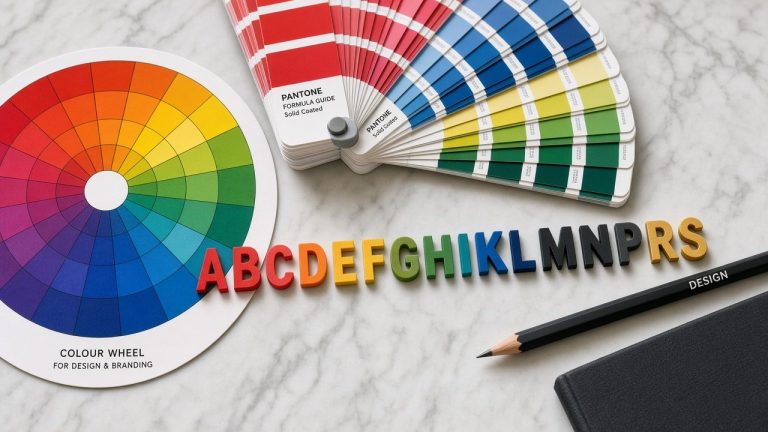
Colour selection is equally pivotal in governing legibility. High-contrast arrangements, such as crisp dark letters against pale substrates or brilliant light lettering on charcoal backdrops, preserve legibility across challenging sightlines. The selected palette should also mirror your brand values: bold modern hues communicate nimble innovation for digital studios, while muted earth tones or wood-fill filament textures deliver an authentic, established feel for specialist craft shops. Always evaluate proposed colourways across various lighting scenarios before manufacturing commences.
Signage Materials and Durability
The physical construction methods used for your display fundamentally dictate its longevity, visual presence, and typographical clarity. For exterior applications, materials must endure wind-driven moisture, fluctuating temperatures, and UV exposure without distorting letter definition. Heavy-duty commercial signs often deploy rigid polymer builds or robust framing to survive exposed commercial environments over extended durations.
Modern digital monitors offer versatile display options indoors, though traditional physical signage remains the cornerstone of distinct premises branding. When configuring 3D printed signs, internal honeycomb infill provides structural rigidity to deeper 40mm or 55mm letter profiles without introducing excessive wall weight. Choosing appropriate materials alongside adequate character spacing ensures dimensional lettering remains crisp and legible regardless of whether it graces an interior reception partition or a sheltered exterior portico.
Common Mistakes Businesses Make with Fonts
It is surprisingly simple for well-meaning business owners to stumble into avoidable typography errors. Typical missteps include:
Such design errors make an organisation appear unorganised and unpolished, needlessly forfeiting valuable customer engagement. Misjudged lettering causes viewer frustration and damages brand credibility, which is why fundamental textual clarity must always take precedence over novelty.
- Selecting an intricate digital font that looks crisp on an illuminated monitor but loses physical definition when converted into a tangible dimensional sign.
- Utilising excessively florid script typefaces that compromise effortless reading at normal walking speeds.
- Defaulting to casual novelty fonts like Comic Sans, which project an informal, amateur appearance unsuited to professional commerce.
- Superimposing complex lettering over heavily textured, patterned, or visually noisy mounting surfaces.
- Combining more than two distinct font families across a single signage layout.
- Failing to calculate actual viewing range, resulting in undersized lettering that vanishes completely across a room or pavement.
How to Choose the Right Font for Your Sign
Determining the perfect typeface requires weighing your commercial sector, building setting, and target demographic. Every typographic choice must be made deliberately to guarantee accessible, effortless reading. Adhering to established visibility standards ensures your finished piece communicates effectively with the widest possible public:
Taking the time to deliberate over these factors before committing your layout to production eliminates costly remakes and ensures your finished branding performs flawlessly.
- Reflect brand values: A legal consultancy benefits from an authoritative, disciplined serif alphabet, whereas an independent bakery can embrace softer, hand-rendered typography.
- Assess the immediate surroundings: High-street shopfronts surrounded by ambient visual clutter demand thick, straightforward letterforms, whereas an indoor boardroom sign can utilise subtler styling.
- Understand your target clientele: An energetic, rounded typeface appeals naturally to families visiting an activity centre, whereas financial advisors require measured, reassuring lines.
- Perform physical visibility tests: Print full-scale paper mock-ups and step back several paces under varied lighting; if reading feels like hard work, adjust scale and spacing immediately.
- Treat safety text strictly: Cautionary indicators, hazard markers, and regulatory direction require bold, high-contrast, distraction-free lettering to ensure immediate compliance.
Signage Accessibility: Making Your Sign Readable for Everyone
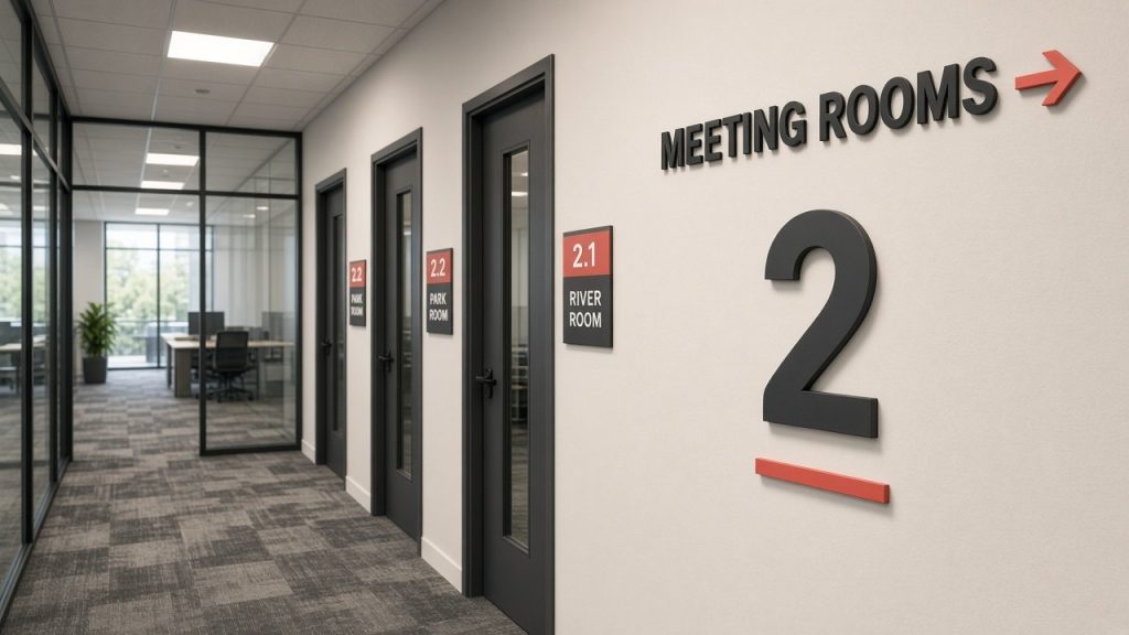
Prioritising accessibility in signage design ensures your company welcomes all patrons, including those coping with partial sight or specific learning differences. Standard sans-serif and uncluttered serif designs offer the highest baseline legibility because their open letter cavities and distinct glyph profiles are easily identified by human cognitive pathways.
Scale and vertical letter height play an indispensable role in accessible design. Generously sized characters accompanied by balanced kerning allow visitors with low vision to orient themselves quickly. Fragile hairline strokes, ultra-condensed forms, or low-contrast colour schemes should be discarded in favour of robust stroke weights and strong tonal separation between text and mounting panels.
Examples of Good Font Use in Signage
Examining how distinct signage styles apply typography in commercial spaces illustrates how letter selection shapes real-world impact:
Many time-tested signage typefaces were refined by specialist punch-cutters and typographers specifically to maintain character definition across extended viewing distances, making them reliable foundations for commercial branding.
- Understated architectural wall signs: Crisp sans-serif lettering fabricated in matt PLA filaments creates a clean, architectural finish suitable for contemporary corporate suites and clinical environments.
- Pavement display boards: Traditional hospitality venues often prefer rustic wood-effect panels printed in wood-fill PLA with recessed or raised filament lettering, offering artisanal charm without messy surface paint.
- Counter and reception signs: Freestanding desk emblems benefit from unembellished typography, ensuring staff titles and company identifiers remain sharp across close-range interactions.
- Navigational wayfinding boards: Transport hubs and public facilities routinely rely on neutral, highly legible fonts like Arial to guide visitors safely without confusion.
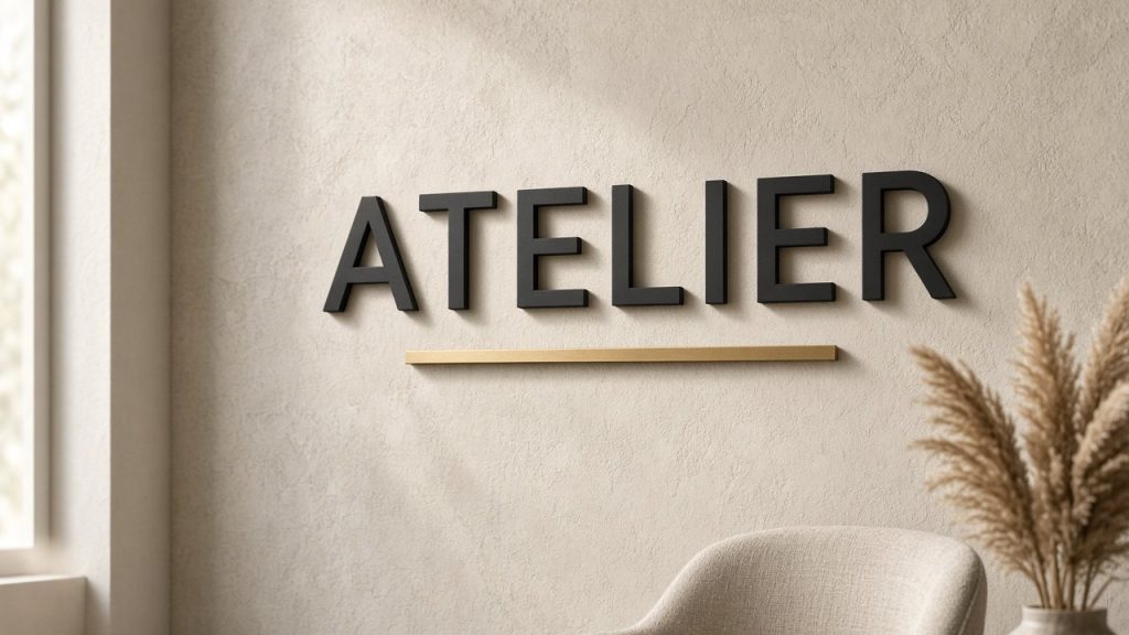
- Dimensional 3D logo installations: Solid dimensional lettering with distinct outlines casts natural boundary shadows, creating strong optical definition against plain wall finishes.
Testing and Evaluating Your Sign for Readability
Before approving final fabrication files, test your artwork thoroughly against real-world viewing conditions. Position a scaled template at the anticipated viewing distance and evaluate whether the wording registers instantaneously without squinting. Observe how the layout performs across different ambient conditions, such as midday sun, diffused overcast light, and low evening illumination. Soliciting candid input from peers with differing visual acuity frequently reveals unexpected legibility bottlenecks, while consulting with our team during the digital proofing stage helps catch narrow character gaps before printing begins.
Signage Trends and Innovations
The commercial display landscape continues to evolve as fabrication technologies advance. Programmable digital panels offer flexible options for dynamic scheduling, though physical dimensional branding remains essential for establishing permanent company presence. Wayfinding systems across education campuses and medical complexes are adopting clearer visual pictograms paired with robust sans-serif lettering to simplify public navigation.
Environmental responsibility is likewise shaping procurement, with businesses seeking sustainable manufacturing methods such as additive FDM 3D printing in plant-based PLA over petrochemical sheets. While clean sans-serif styles continue to dominate modern fit-outs, pairing them with tactile filament finishes—such as silk metallic sheen or wood-fibre textures—enables companies to convey bespoke refinement while preserving effortless reading.
Practical Tips Before Ordering Your Sign
Prior to approving your design files for production, review these essential preparation checks:
- Verify your logo typography scales upwards smoothly without thin script tails shrinking below printable tolerances.
- Examine scaled proof templates at full intended dimensions to judge physical character proportions accurately.
- Review chosen filament colour combinations under both daylight and internal lighting to confirm sufficient tonal contrast.
- Consult your sign maker regarding manufacturing tolerances, as additive 3D printing requires minimum wall thicknesses unlike flat print.
Conclusion
Typography is far more than a minor layout detail; it directly governs the functional success of every piece of business signage. Thoughtfully selected letterforms reinforce your brand character while ensuring prospective customers grasp your message effortlessly from any angle. Whether developing an exterior entrance sign, a portable A-frame, or a raised dimensional wall logo, clear typography remains the secret to lasting visual impact.
If you are refining your brand artwork and feel uncertain about which typeface will reproduce cleanest in three dimensions, our workshop team is on hand to assist. We provide a digital proof before every build, ensuring your finished sign delivers outstanding legibility and pride of place on your wall.
Ready to Bring Your Logo Typography to Life?
Send us your artwork today for a complimentary digital proof and expert advice on translating your typography into a striking 3D printed business sign.