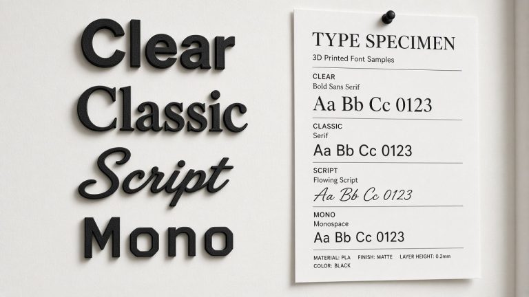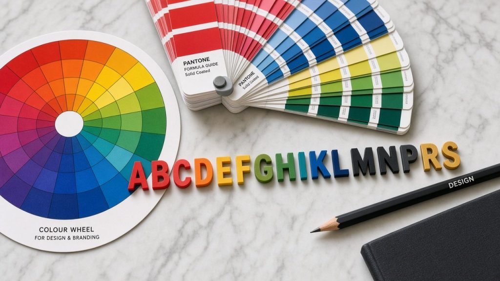
Tones and shades do far more than simply brighten up an office wall; they serve as critical building blocks in your commercial visual identity. For enterprises investing in architectural features, grasping how hues alter human perception is often the deciding factor in forging a memorable impression. From dimensional company emblems in corporate boardrooms to entrance logos in welcoming reception areas, every tint conveys an unspoken message.
Within this guide, we examine the behavioural science underpinning colour selection for commercial displays. We help you choose tones aligned with your corporate ethos that steer client responses, whilst showing how bespoke fabrications like our 3D printed matt logo wall sign and 3D printed wall plaque translate those exact shades into physical form.
Why Colour Matters in Business Signs
A sign’s chromatic character is frequently the very first detail registered by the human eye. Industry research highlights several remarkable tendencies:
- Upwards of ninety per cent of immediate product appraisals stem exclusively from colour perception.
- Consistent chromatic branding enhances customer brand recall by up to eighty per cent.
- Draw immediate focus toward your premises or reception area.
- Establish an authentic atmosphere that encapsulates your company ethos.
- Shape whether your enterprise feels dependable, friendly or exceptionally prestigious.
- Trigger prompt purchasing behaviour or stimulate emotional engagement.
- Direct visitor attention toward critical notices and navigation pathways.
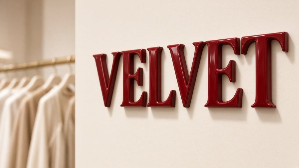
Common Colours and What They Communicate
Every distinct tint evokes specific associations in the mind of the viewer. Selecting the right base tone ensures your physical branding aligns seamlessly with your operational values.
Blue: Dependability, Integrity, Professionalism
Widely favoured across financial practices, software firms and medical facilities, deep or mid blue represents an assured, calming choice for corporate office emblems and commercial consulting rooms.
Well suited to: legal chambers, wealth managers, healthcare surgeries and business-to-business agencies.
Red: Vitality, Passion, Urgency
Vibrant red instantly commands optical dominance. Dynamic and thoroughly assertive, it excels at generating enthusiasm or signalling vital points of interest.
Well suited to: fitness centres, culinary brands, entertainment spaces and prominent promotional statements.
Yellow: Warmth, Originality, Youthful Energy
Bright yellow radiates cheerful optimism. It integrates nicely within innovative studios or informal commercial settings, though careful balance prevents it becoming visually fatiguing.
Well suited to: creative consultancies, early years organisations, incubators and modern lifestyle studios.
Black: Authority, Elegance, Modern Precision
Solid black asserts uncompromising prestige and architectural weight. It forms an exceptional contrast when paired alongside silk metallic gold or understated silver filaments.
Well suited to: high-end retail, architectural practices, boutique consultancies and contemporary technology firms.
White: Clarity, Purity, Uncluttered Space
Crisp white communicates transparency and modern minimalism. In dimensional signage fabrication, it frequently performs best as a neutral backboard or contrasting raised lettering element.
Well suited to: clinical environments, holistic therapy rooms, dental practices and Nordic-inspired interiors.
Green: Vitality, Harmony, Environmental Stewardship
Natural green provides an intrinsically restful presence tied to wellness and organic living. It serves businesses aiming to display genuine environmental awareness.
Well suited to: sustainable enterprises, organic food dispensaries, wellness clinics and garden design studios.
Purple: Imagination, Prestige, Sensory Luxury
Merging the calm assurance of blue with red energy, purple delivers a refined, opulent and contemplative character.
Well suited to: aesthetic practitioners, day spas, luxury artisan workshops and boutique lifestyle brands.
How Colour Affects Customer Perception
To appreciate the practical outcome of colour science, consider how individual filament tones translate into immediate workplace impressions and subsequent customer actions:
Blue communicates calm competence, prompting clients to place confidence in your team. Red conveys assertive drive, encouraging immediate decision-making. Black expresses understated quality, leading visitors to anticipate premium standards. Green establishes an organic, balanced ambience that helps guests unwind immediately. Yellow conveys approachable warmth, stimulating relaxed curiosity and informal dialogue.
Selecting strong contrasting tones across your logo components guarantees legible typography from across the room, ensuring your entrance sign remains striking from every vantage point.
Choosing the Right Colour for Your Signage
Balancing aesthetics with commercial intent requires balancing brand guidelines against the physical attributes of your interior space.
Corporate Identity and Ethos
Determine whether your organisation leans towards formal restraint or vibrant informality. The chosen palette must embody your fundamental business standards.
Target Demographic Expectations
The visual palette expected by patrons of an accountancy firm diverges entirely from the vibrant aesthetic anticipated by clients entering a creative design agency.
Surrounding Environment and Light
A dimly illuminated corridor often demands lighter filament colours to stand out, whereas a sunlit atrium will benefit from non-reflective matt filaments that eliminate harsh glare.
Bringing Colour to Life with 3D Matt PLA Wall Signs
A highly effective way to present brand palettes is through layered additive manufacturing. Our 3D printed matt logo wall sign provides a crisp, glare-free presentation, reproducing your corporate colours with remarkable physical substance rather than shiny plastic sheet.
Rather than relying on flat vinyl stickers or painted composite boards, our additive production produces freestanding volumetric shapes with colour running solid throughout the entire component.
Key Characteristics Include
Each emblem element is printed from dedicated filament spools, ensuring dense colouration without surface paint that could scratch away over time.
- Defined geometric edges that deliver superb visual definition under spotlighting
- Smooth, non-reflective matt exterior that remains legible under intense office lighting
- Robust internal structure engineered specifically for internal workplace display
- Accurate adaptation of multi-toned corporate identity graphics without messy inks
Using 3D Wall Plaques to Highlight Accents
When an emblem contains secondary tones or fine typographic details, a 3D printed wall plaque offers a cohesive backing structure that ties disparate tones into a unified display. Consider these balanced combinations:
- A matt black plaque base carrying silk gold raised letters to signify established luxury.
- A clean white mounting plate hosting navy blue typography for an aura of clinical precision.
- A silk silver backboard featuring vibrant crimson raised elements to produce energetic contrast.
- Executive boardroom display walls
- Front-of-house reception desk backdrops
- Corporate value boards and brand mission installations
- Every plaque is supplied alongside high-bond foam adhesive pads and a custom positioning template, allowing straightforward fitting across standard plastered walls, timber panels or tiled partitions.
Tips for Harmonising Multiple Colours in Signage
When your emblem contains an extensive range of tones, follow these foundational principles to maintain a clean, sophisticated outcome:
- Limit the primary palette to two or three shades: designate one dominant colour and let subsidiary hues provide subtle balance.
- Mount against neutral surfaces: positioning saturated filament tones against white, charcoal or natural timber allows vivid letters to project cleanly.
- Prevent conflicting undertones: adhere closely to your official vector brand rules or ask our workshop team for a digital proof before manufacturing begins.
- Select matt over gloss for interior walls: non-reflective PLA avoids the awkward specular glare common to gloss acrylic under fluorescent tubes.
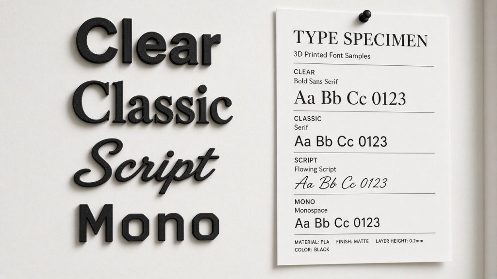
- Pair suitable typefaces with chosen tones: ensure typographic weights remain easily legible so your colour harmony aids readability rather than hindering it.
Measuring the Effectiveness of Business Signs
Assessing the commercial return on your bespoke branding display is vital for any enterprise investing in workplace fit-outs. A well-conceived sign achieves far more than announcing your trading name; it reinforces brand credibility, reassures visiting clients and quietly fosters commercial growth. Yet how can an organisation quantify this influence?
Start by observing visual exposure and footfall attention. For customer-facing doorways or sheltered entrances using our outdoor 3D printed PETG wall plaque, counting visitors who pause to inspect your branding provides a baseline measure of visual impact.
Client interaction serves as another valuable indicator. Take note whenever customers compliment your front-desk setup, share photos of your reception area on LinkedIn, or mention your signage during commercial consultations. Direct conversion rates, such as visiting clients commenting on the professional feel of your premises prior to signing agreements, demonstrate the tangible worth of your physical branding.
The construction medium selected plays a central role in this enduring appeal. While traditional sign shops rely on sheet acrylic or sheet metal, our FDM additive process builds components using tough PLA or weather-tolerant PETG, providing rich, non-fading colour throughout the solid part. This approach yields lasting visual appeal without delaminating vinyl or flaking paintwork.
Conclusion
The palette you appoint for your company signage performs an active commercial role far beyond mere decoration. By harnessing the psychological influence of colour, you can commission 3D printed logos and plaques that:
Whether your identity relies on reassuring blues, energetic reds or sophisticated silk metallics, let your interior displays speak with clarity, texture and purpose. Through our workshop options such as the 3D printed matt logo wall sign and tailored wall plaques, your brand can make a lasting impression across every visitor touchpoint.
- Cultivate immediate client trust and professional confidence
- Attract your ideal commercial demographic
- Express your corporate values with three-dimensional depth
Bring Your Brand Colours to Life in 3D
Send us your vector logo today to receive a complimentary digital proof and expert advice on translating your brand colours into our premium 3D printed PLA and PETG finishes.